Color is one of the world’s most powerful storytellers. Long before players read a quest, meet an NPC, or hear a line of dialogue, the palette of a zone sets its emotional tone. Color guides expectation, mood, and atmosphere, shaping how players interpret landscapes, conflicts, and themes. Each expansion uses color not only to define aesthetics but to communicate deeper narrative meaning — from hope and wonder to chaos and decay.
This article explores how color theory influences emotional engagement, how palettes evolve across expansions, and why color remains one of the world’s most effective silent narrators.

Color as Emotional Language
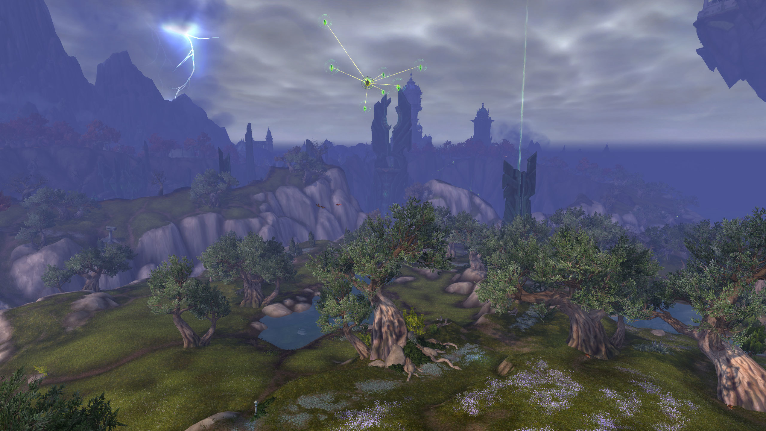
Every expansion begins by establishing its emotional palette. Warm hues inspire calm or nostalgia; cool tones evoke mystery or distance; sickly greens and purples suggest corruption or decay. These choices are deliberate — each color carries emotional weight that shapes how players interpret the world. Even without dialogue, players can sense whether a zone is safe, dangerous, sacred, or wounded simply through the palette surrounding them.
Color becomes a vocabulary the world speaks fluently.
Palette Choices Reflect Expansion Themes
Expansions convey their thematic identity through color. Pandaria’s gentle golds and greens radiate tranquility and balance. Northrend’s icy blues and desaturated grays express loneliness and looming tragedy. The Shadowlands use fractured neon and spectral hues to show reality stretched thin. Dragonflight embraces bright chromatic tones to represent renewal and ancient magic. Each palette tells players what emotional journey awaits.
To highlight how palettes match themes, here is a simple overview:
| Expansion | Dominant Palette | Emotional Tone |
|---|---|---|
| The Burning Crusade | Fel green, violet, fractured red | Chaos, strangeness, cosmic danger |
| Mists of Pandaria | Warm sunlight, soft greens, jade hues | Serenity, balance, ancient wisdom |
| Legion | Dark blacks mixed with fel neon | Threat, corruption, impending doom |
| Dragonflight | Bright chromatics, sky blues, warm gold | Freedom, discovery, rebirth |
Zone Identity Expressed Through Hue
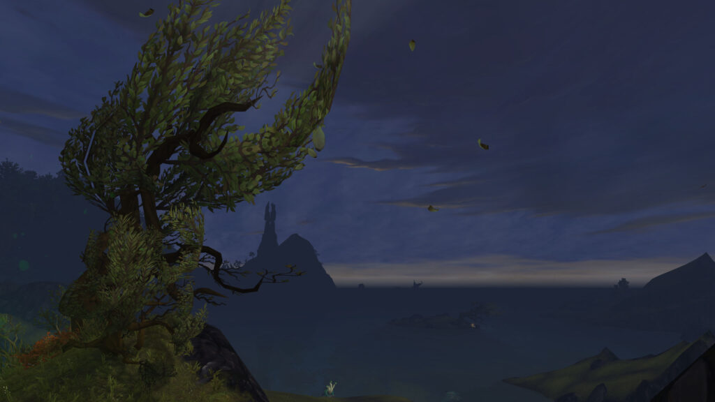
Individual zones rely on specific colors to define identity. Grizzly Hills’ warm autumn palette creates a sense of comfort and nostalgia. Suramar’s luminous purples and twilight blues breathe elegance and arcane decadence. Zuldazar’s saturated golds and deep greens reflect jungle royalty and ancient tradition. These hues linger in player memory long after leveling is over, becoming sensory anchors tied to entire expansions.
Color transforms landscapes into emotional experiences.
Contrast as a Narrative Tool
Color contrast often signals narrative conflict. A corrupted grove might shift from vibrant green to wounded red; a peaceful valley may darken as a storm approaches; an arcane rift may cut luminous violet into an otherwise earthy palette. These contrasts reveal tension without a single line of text. The world shows its struggle visually, urging players to interpret meaning through instinct.

Contrast turns color into story.
Why Color Still Shapes Player Memory
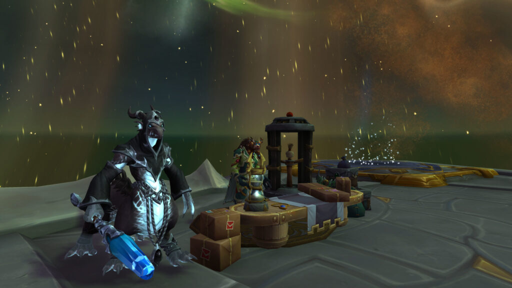
Players often recall expansions through their palettes — not just their plotlines. Memories form around emotional impressions, and color acts as the foundation for these impressions. Vibrant areas feel hopeful; desaturated regions feel somber; neon-infused zones feel otherworldly. Because color shapes mood instantly, it becomes one of the most enduring aspects of world identity.
Color is the emotional heartbeat of visual storytelling.
Conclusion
Color theory shapes the world’s emotional landscape by defining tone, guiding expectation, and enriching storytelling. Through palette choices, contrast, and thematic consistency, each expansion builds an identity that players feel before they fully understand. Color remains one of the world’s most powerful tools — a silent storyteller that shapes memory, mood, and connection across every journey.